Graphic tools
The aqua.core.graphics module provides a set of simple functions to easily plot the result of analysis done within AQUA.
Plot styles
AQUA supports in the available graphical functions the matplotlib styles.
A default for the plot appearance is present in the aqua.mplstyle file (in aqua/core/config/styles),
and this includes all the default settings for the plot functions.
This file can be modified to change the default appearance of the plots.
Other styles can be created following the matplotlib guidelines.
The style can be set automatically by setting the style keyword in the config-aqua.yaml file generated during the code installation (see Getting Started).
The new file should be placed in the same folder as the default one (it may need to run aqua install again).
It is also possible to set the style only for a single plot by using the style keyword in the plotting functions.
Finally, other than file-based styles, it is possible to set the style from the list of available styles in matplotlib.
Single map
A function called plot_single_map() is provided with many options to customize the plot.
The function takes as input an xarray.DataArray, with a single timestep to be selected
before calling the function. The function will then plot the map of the variable and,
if no other option is provided, will adapt colorbar, title and labels to the attributes
of the input DataArray. Not only longitude-latitude grids are supported, but also HEALPix
data, which are automatically resampled to a regular lon-lat grid before plotting.
The function is built on top of the cartopy and matplotlib libraries,
and it is possible to customize the plot with many options, including a different projections.
In the following example we plot an sst map from the first timestep of ERA5 reanalysis:
from aqua import Reader
from aqua.core.graphics import plot_single_map

reader = Reader(model='ERA5', exp='era5', source='monthly')
tos = reader.retrieve(var=["tos"])
tos_plot = tos["tos"].isel(time=0)

plot_single_map(tos_plot, title="Example of a custom title")
This will produce the following plot:

Single map with differences
A function called plot_single_map_diff() is provided with many options to customize the plot.
The function is built as an expansion of the plot_single_map() function, so that arguments and options are similar.
The function takes as input two xarray.DataArray, with a single timestep.
The function will plot as colormap or contour filled map the difference between the two input DataArray (the first one minus the second one). Additionally a contour line map is plotted with the first input DataArray, to show the original data. Again, not only longitude-latitude grids are supported, but also HEALPix data, which are automatically resampled to a regular lon-lat grid.

Example of a plot_single_map_diff() output done with the teleconnections diagnostic from the aqua-diagnostics module.
The map shows the correlation for the ENSO teleconnection between ICON historical run and ERA5 reanalysis.
Projections and custom maps
AQUA also supports a wide variety of map projections provided by the cartopy library.
To simplify projection selection,
a utility function get_projection() is provided, which accepts a lowercase function names (e.g. "plate_carree") to select the
desired projection.
A dictionary with the complete list of available projections can be found in the projections.py file in the aqua/core/util folder.
The function get_projection() also accepts additional keyword arguments depending on the selected projection and and user-defined plotting requirements.
The returned cartopy.crs objects can be used directly with plot_single_map().
A minimal example using subplots with different projections is shown below:
import matplotlib.pyplot as plt
from aqua.core.graphics import plot_single_map
from aqua.core.util import get_projection

# Define a dictionary with projection names and the wanted extra parameters from Cartopy
projections = {"plate_carree": {},
    "nearside": {"central_longitude": 0, "central_latitude": 20, "satellite_height": 35785831},
    "robinson": {"central_longitude": 70},
    "aitoff": {"central_longitude": 85.3}
    }

fig = plt.figure(figsize=(14, 10))

for i, name in enumerate(projections.keys()):
    kwargs = projections.get(name, {})
    proj = get_projection(name, **kwargs)

    ax = fig.add_subplot(2, 2, i + 1, projection=proj)
    plot_single_map(tos_plot, proj=proj, ax=ax, fig=fig, contour=False) # Note: tos_plot is the retrieved data as in example above
This code will produce a single figure with four different map projections, all displaying the same data.

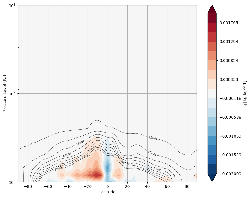
Vertical profiles
Two functions called plot_vertical_profile() and plot_vertical_profile_diff() are provided with many options to customize the plot.
The first function is used to plot a single vertical profile, while the second one is used to compare two vertical profiles by plotting the difference between them.
The functions take as input xarray.DataArrays with vertical profiles of a variable.
If no other option is provided, will adapt colorbar, title and labels to the attributes of the input DataArray.
The vertical profiles can be plotted with a logarithmic scale for the x-axis and with contour lines from the main dataset overlaid on the difference plot.
The vertical levels and the horizontal coordinate can be specified through the lev_name and x_coord arguments.
In the following example we plot the vertical profile of specific humidity from the first timestep of IFS-NEMO historical-1990:
from aqua import Reader
from aqua.core.graphics import plot_vertical_profile, plot_vertical_profile_diff

reader = Reader(model="IFS-NEMO", exp="historical-1990", source="lra-r100-monthly")
data = reader.retrieve()
data = data['q'].isel(time=1).mean('lon')
plot_vertical_profile(data=data, var='q', lev_name='plev', x_coord='lat', vmin=-0.002, vmax=0.002, logscale=True)

reader = Reader(model="ERA5", exp="era5", source="monthly")
data_ref = reader.retrieve()
data_ref = data_ref['q'].isel(time=1).mean('lon')
plot_vertical_profile_diff(data=data, data_ref=data_ref, var='q', lev_name='plev', x_coord='lat',
                           vmin=-0.002, vmax=0.002,
                           vmin_contour=-0.002, vmax_contour=0.002,
                           logscale=True, add_contour=True)
This will produce the following plot:
Vertical lines
A function called plot_vertical_lines() is provided with many options to customize the plot.
The function takes as input a list of xarray.DataArray, each one representing a vertical profile,
with the possility to plot multiple lines for different models and special lines for a reference dataset.
The vertical profiles can be plotted with a logarithmic scale for the x-axis and with the possibility to invert the y-axis.
The vertical levels coordinate can be specified through the lev_name argument.
See the API documentation for more details.
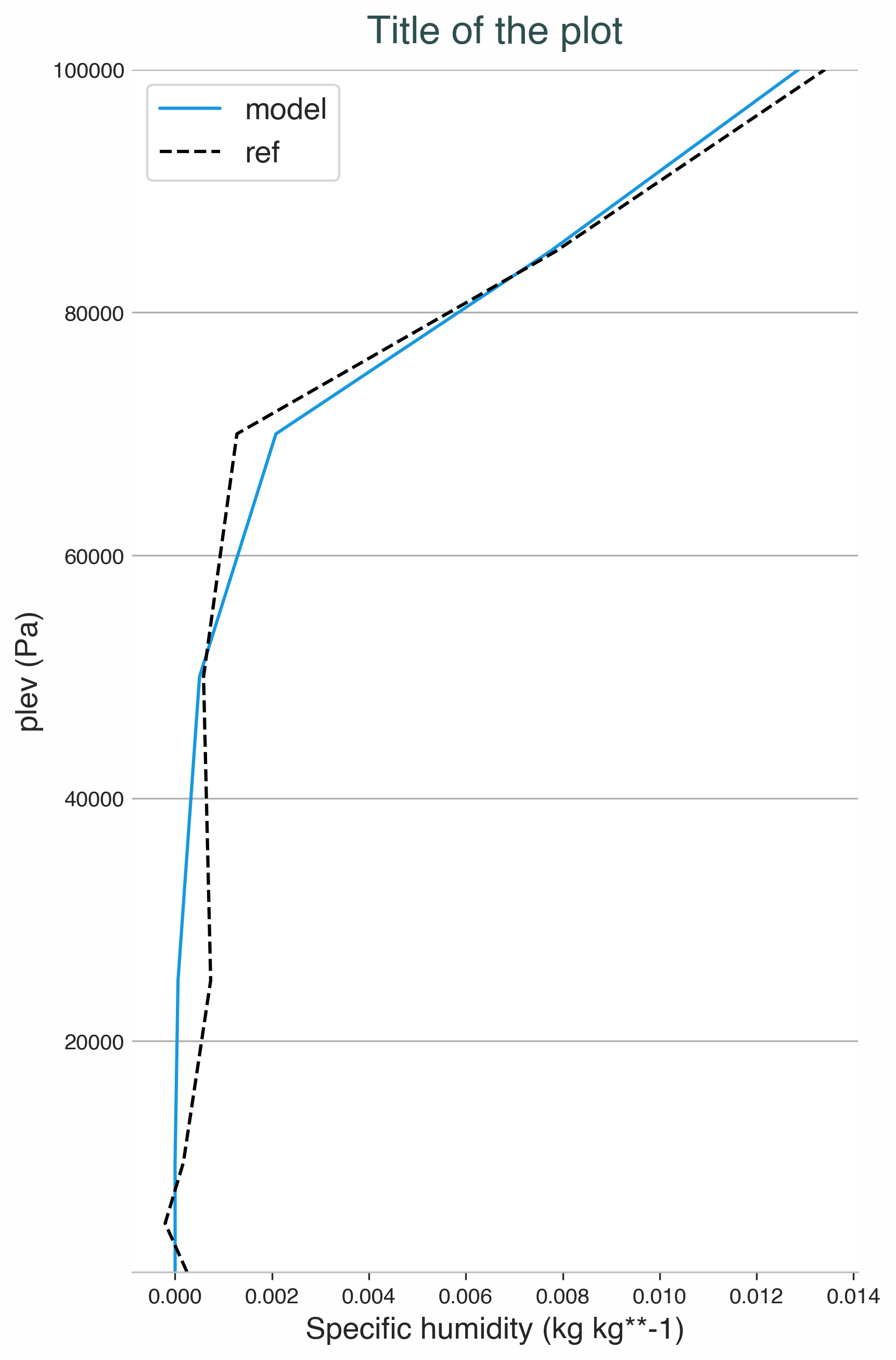
Example of a plot_vertical_lines() output.
The plot shows the vertical profile of specific humidity for a random cell of a healpix zoom level 3 version of ERA5.
Reference is generated by adding a small noise to the data.
Time series
A function called plot_timeseries() is provided with many options to customize the plot.
The function is built to plot time series of a single variable,
with the possibility to plot multiple lines for different models and special lines for a reference dataset.
The reference dataset can have a representation of the uncertainty over time using the standard deviation arguments.
It is also possible to plot the ensemble mean of the models and its standard deviation.
If the ensemble mean is provided, the monthly and annual time series of the models are plotted as grey lines,
considered as the ensemble spread, while the ensemble mean is plotted as a thick line.
By default the function is built to be able to plot monthly and yearly time series.
The function takes as data input:
monthly_data: a (list of)
xarray.DataArray, each one representing the monthly time series of a model.annual_data: a (list of)
xarray.DataArray, each one representing the annual time series of a model.ref_monthly_data: a (list of)
xarray.DataArrayrepresenting the monthly time series of the reference dataset.ref_annual_data: a (list of)
xarray.DataArrayrepresenting the annual time series of the reference dataset.std_monthly_data: a (list of)
xarray.DataArrayrepresenting the monthly values of the standard deviation of the reference dataset.std_annual_data: a (list of)
xarray.DataArrayrepresenting the annual values of the standard deviation of the reference dataset.ens_monthly_data: a
xarray.DataArrayrepresenting the ensemble mean of the monthly time series of the models.ens_annual_data: a
xarray.DataArrayrepresenting the ensemble mean of the annual time series of the models.std_ens_monthly_data: a
xarray.DataArrayrepresenting the monthly values of the standard deviation of the ensemble mean of the models.std_ens_annual_data: a
xarray.DataArrayrepresenting the annual values of the standard deviation of the ensemble mean of the models.
The function will automatically plot what is available, so it is possible to plot only monthly or only yearly time series, with or without a reference dataset.
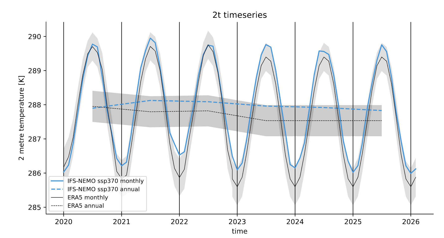
Example of a plot_timeseries() output done with the timeseries diagnostic.
The plot shows the global mean 2 meters temperature time series for the IFS-NEMO scenario and the ERA5 reference dataset.
Seasonal cycle
A function called plot_seasonalcycle() is provided with many options to customize the plot.
The function takes as data input:
data: a
xarray.DataArrayrepresenting the seasonal cycle of a variable.ref_data: a
xarray.DataArrayrepresenting the seasonal cycle of the reference dataset.std_data: a
xarray.DataArrayrepresenting the standard deviation of the seasonal cycle of the reference dataset.
The function will automatically plot what is available, so it is possible to plot only the seasonal cycle, with or without a reference dataset.

Example of a plot_seasonalcycle() output done with the timeseries diagnostic.
The plot shows the seasonal cycle of the 2 meters temperature for the IFS-NEMO scenario and the ERA5 reference dataset.
Multiple maps
A function called plot_maps() is provided with many options to customize the plot.
The function takes as input a list of xarray.DataArray, each one representing a map.
It is built on top of plot_single_map() with which it shares many options.
The maps are plotted with the possibility to set individual titles and with a shared colorbar.
Figsize is automatically adapted and the number of plots and their position is automatically evaluated.

Example of a plot_maps() output.
Multiple maps with differences
A function called plot_maps_diff() is provided with many options to customize the plot.
The function is built as an expansion of the plot_maps() function, so that arguments and options are similar.
The function takes as input two lists of xarray.DataArray, one called maps and the other maps_ref.
similarly to the plot_single_map_diff() function, the first list is plotted as contour lines and the difference
between the two lists is plotted as filled contours.

Example of a plot_maps_diff() output.