Graphic tools
The aqua.graphics module provides a set of simple functions to easily plot the result of analysis done within AQUA.
Plot styles
AQUA supports in the available graphical functions the matplotlib styles.
A default for the plot appearance is present in the aqua.mplstyle file (in config/styles),
and this includes all the default settings for the plot functions.
This file can be modified to change the default appearance of the plots.
Other styles can be created following the matplotlib guidelines.
The style can be set automatically by setting the style keyword in the config-aqua.yaml file generated during the code installation (see Getting Started).
The new file should be placed in the same folder as the default one (it may need to run aqua install again).
It is also possible to set the style only for a single plot by using the style keyword in the plotting functions.
Finally, other than file-based styles, it is possible to set the style from the list of available styles in matplotlib.
Single map
A function called plot_single_map() is provided with many options to customize the plot.
The function takes as input an xarray.DataArray, with a single timestep to be selected before calling the function. The function will then plot the map of the variable and, if no other option is provided, will adapt colorbar, title and labels to the attributes of the input DataArray.
The function is built on top of the cartopy and matplotlib libraries,
and it is possible to customize the plot with many options, including a different projection.
In the following example we plot an sst map from the first timestep of ERA5 reanalysis:
from aqua import Reader, plot_single_map

reader = Reader(model='ERA5', exp='era5', source='monthly')
tos = reader.retrieve(var=["tos"])
tos_plot = tos["tos"].isel(time=0)

plot_single_map(tos_plot, title="Example of a custom title")
This will produce the following plot:

Single map with differences
A function called plot_single_map_diff() is provided with many options to customize the plot.
The function is built as an expansion of the plot_single_map() function, so that arguments and options are similar.
The function takes as input two xarray.DataArray, with a single timestep.
The function will plot as colormap or contour filled map the difference between the two input DataArray (the first one minus the second one). Additionally a contour line map is plotted with the first input DataArray, to show the original data.
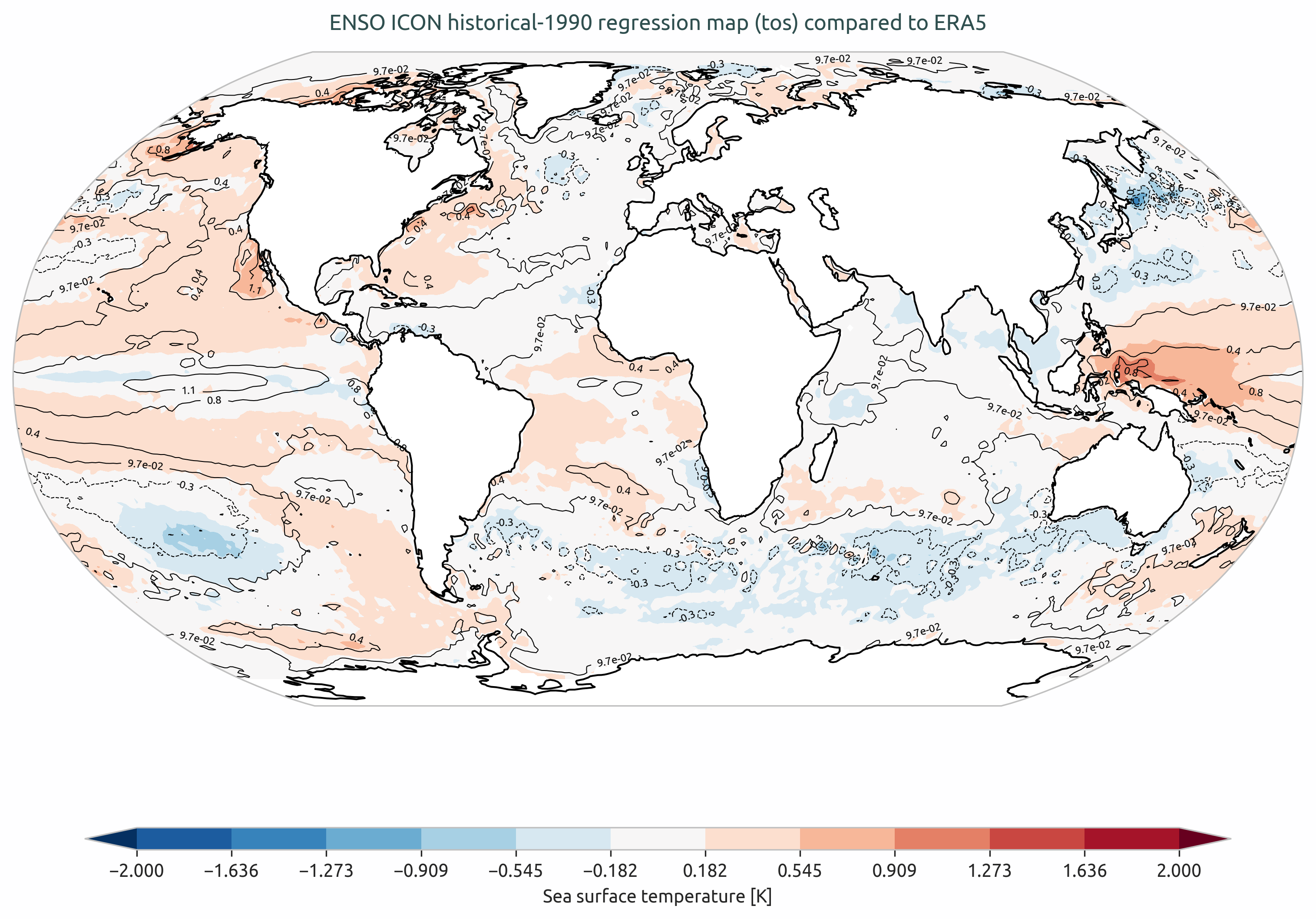
Example of a plot_single_map_diff() output done with the Teleconnections diagnostic.
The map shows the correlation for the ENSO teleconnection between ICON historical run and ERA5 reanalysis.
Time series
A function called plot_timeseries() is provided with many options to customize the plot.
The function is built to plot time series of a single variable,
with the possibility to plot multiple lines for different models and a special line for a reference dataset.
The reference dataset can have a representation of the uncertainty over time.
By default the function is built to be able to plot monthly and yearly time series, as required by the Timeseries diagnostic.
The function takes as data input:
monthly_data: a (list of) xarray.DataArray, each one representing the monthly time series of a model.
annual_data: a (list of) xarray.DataArray, each one representing the annual time series of a model.
ref_monthly_data: a xarray.DataArray representing the monthly time series of the reference dataset.
ref_annual_data: a xarray.DataArray representing the annual time series of the reference dataset.
std_monthly_data: a xarray.DataArray representing the monthly values of the standard deviation of the reference dataset.
std_annual_data: a xarray.DataArray representing the annual values of the standard deviation of the reference dataset.
The function will automatically plot what is available, so it is possible to plot only monthly or only yearly time series, with or without a reference dataset.
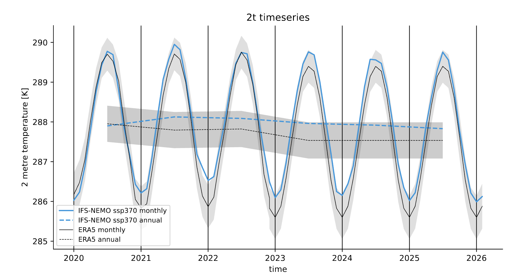
Example of a plot_timeseries() output done with the Timeseries.
The plot shows the global mean 2 meters temperature time series for the IFS-NEMO scenario and the ERA5 reference dataset.
Seasonal cycle
A function called plot_seasonalcycle() is provided with many options to customize the plot.
The function takes as data input:
data: a xarray.DataArray representing the seasonal cycle of a variable.
ref_data: a xarray.DataArray representing the seasonal cycle of the reference dataset.
std_data: a xarray.DataArray representing the standard deviation of the seasonal cycle of the reference dataset.
The function will automatically plot what is available, so it is possible to plot only the seasonal cycle, with or without a reference dataset.
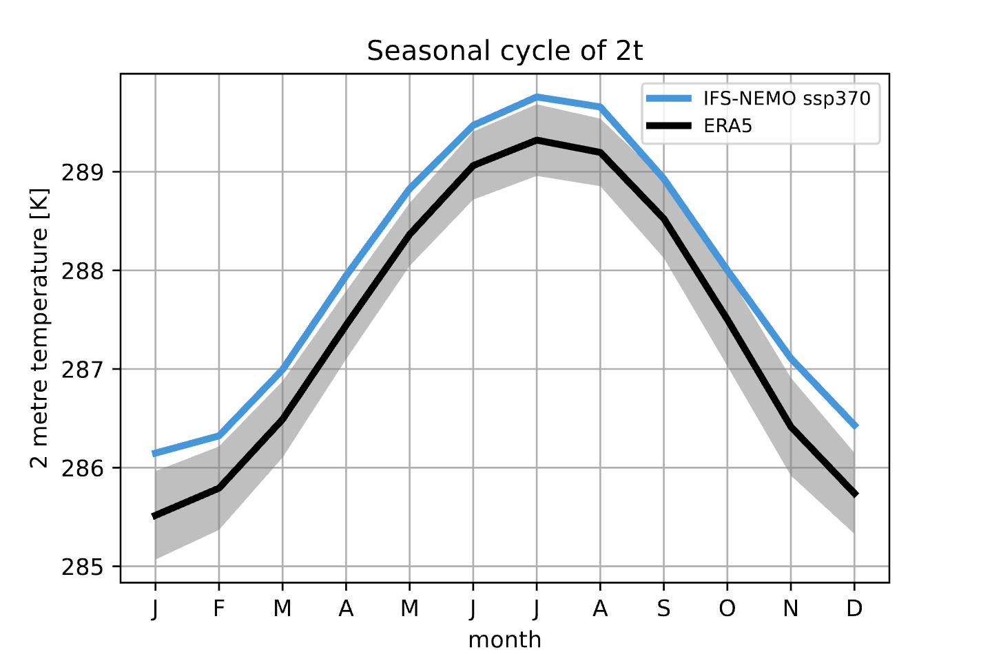
Example of a plot_seasonalcycle() output done with the Timeseries.
The plot shows the seasonal cycle of the 2 meters temperature for the IFS-NEMO scenario and the ERA5 reference dataset.
Multiple maps
A function called plot_maps() is provided with many options to customize the plot.
The function takes as input a list of xarray.DataArray, each one representing a map.
It is built on top of plot_single_map() with which it shares many options.
The maps are plotted with the possibility to set individual titles and with a shared colorbar.
Figsize is automatically adapted and the number of plots and their position is automatically evaluated.
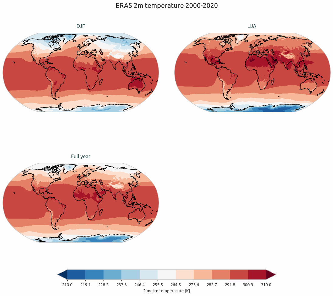
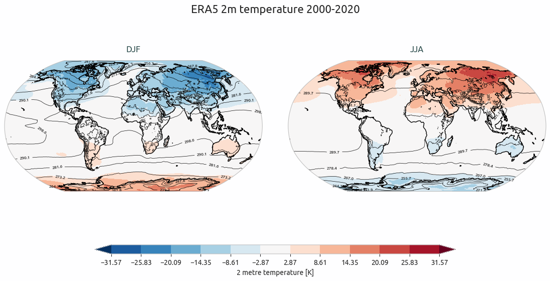
Example of a plot_maps() output.
Multiple maps with differences
A function called plot_maps_diff() is provided with many options to customize the plot.
The function is built as an expansion of the plot_maps() function, so that arguments and options are similar.
The function takes as input two lists of xarray.DataArray, one called maps and the other maps_ref.
similarly to the plot_single_map_diff() function, the first list is plotted as contour lines and the difference
between the two lists is plotted as filled contours.
Example of a plot_maps_diff() output.